
Editorial
Campaign clock vs stable catalog on Shopify homepages
Updated
StoreAtlas editors
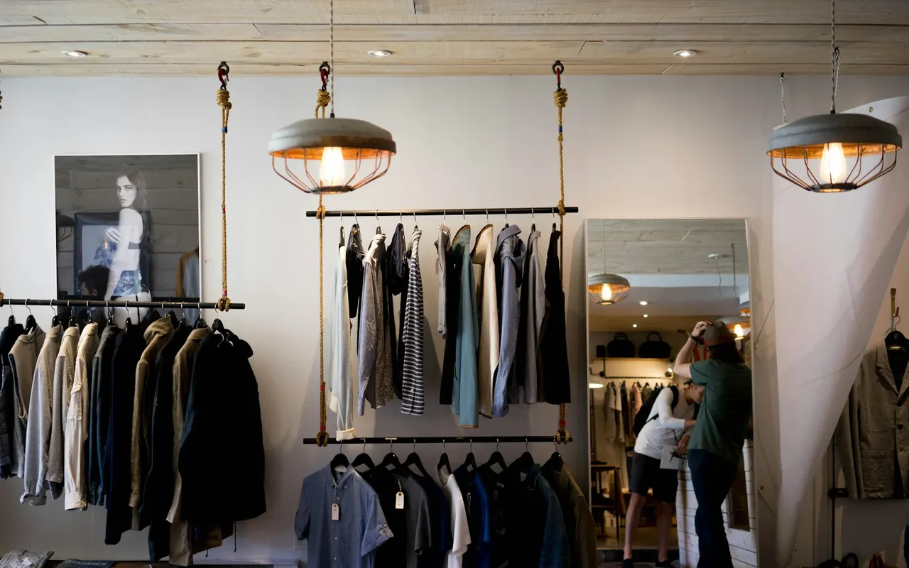
Shopify homepages run on two clocks. A campaign clock treats this week’s collection as the product. A stable catalog treats a basics wall as the product. Shopping one as if it were the other is how sizes vanish or how a page feels noisy for no reason.
This is a category-guide, not a brand score. Training apparel often sits on the campaign pole; some materials-led fashion sits on the stable pole. Confirm the current grid on the official site.
The weekly-refresh homepage
Navigation stays on training or collection labels so a new drop has a place to land. The first screen is a now page. The size you saw on Monday may be gone on Thursday. If you need a full kit in one size, treat it like a drop calendar: check the PDP, then decide. We will not invent restock dates.
The basics wall
A stable catalog can still run a sale banner. The difference is whether the object of the homepage is a lasting grid. Reorder shoppers can come back next month for the same short. People who want a refresh cycle will find it quiet.
How to tell which clock you are on
Ask whether the first screen would still make sense in six weeks. If it is dated to a campaign name, you are on a clock. If it is a materials or volume comparison that could sit all season, you are on a shelf.
Fashion and fitness both use both tempos. Do not file a category as one clock. Use fashion Shopify storefront notes for apparel-specific tells.
Fit, not a rating
A fast cadence is a product decision. It is not “better merchandising.” A stable wall is not “lazy.” StoreAtlas describes the clock. The listing stays the short file; this page is the habit you take to the next homepage.
Mixed clocks on one site
Some brands run a campaign hero over a fairly stable grid. Believe the object you can add to cart, not the film. If the SKU is gone when the campaign ends, you were on a clock after all.