
Editorial
What makes a good Shopify store design
Updated
StoreAtlas editors
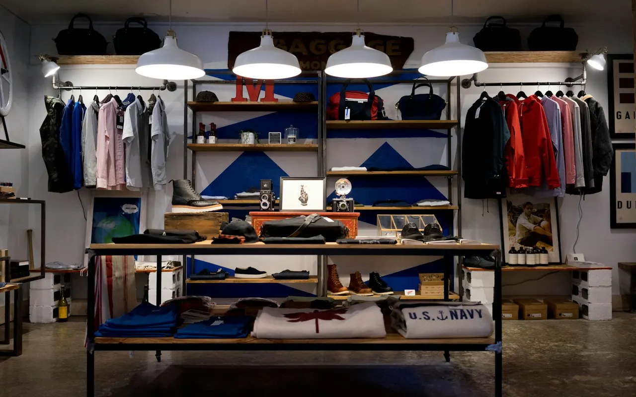
What makes a good Shopify store design is not a fashionable theme. It is whether the homepage’s first job matches the catalog, and whether a shopper can find the rules that change the purchase — shipping, returns, size, membership — without a scavenger hunt.
We do not score “best Shopify themes.” Two stores can share a theme and still read as opposite rooms. This note is about reading design as merchandising, the same way we file the directory.
Design is a decision surface
A homepage is a surface for one or two decisions. Good design makes those decisions cheap. A materials-led shoe site puts fiber next to the product. A spec-led bag site puts liters and attachments where a lookbook would put a ridge. A subscription box puts tiers where a toy aisle would put a single SKU.
Bad design (for shopping) is not ugly type. It is a film that hides the object, a mega-menu that buries the set, or a locale that implies the world ships when the table does not.
Photography that works vs photography that substitutes
Quiet product photography lets copy do work. Campaign stills can be the product when the brand is selling a drop. The failure mode is substitution: lifestyle fills the fold, and composition, care, or volume never appear.
When you compare fashion DTCs, ask if you can leave the first screen knowing what the thing is made of or how it is meant to be worn. When you compare outdoor DTCs, ask if volume is comparable in one view. Those questions are in fashion Shopify storefront notes and the outdoor store-reads.
Navigation that tells the truth
Navigation is a claim about the catalog. Training categories that absorb a weekly refresh tell you the clock is a campaign. Aisles and filters tell you the store is a shelf. A single “shop” dump tells you the merchant has not decided.
Good design does not need novelty in the header. It needs labels that match collections that actually exist this week.
Rules belong in the same room as the cart
Shipping and returns are design. If they only exist in a help center no one opens, the storefront is unfinished. Membership prices that appear only at checkout are a bait layout. Read shipping and returns before you treat a tile as a contract.
What we will not call “good”
We will not call a page good because it looks expensive. We will not call it good because it ranks. We will not invent a 10-point UI score. A good Shopify store design, for this site, is a page you can evaluate with the checklist in a few minutes — then leave for the official URL.
Theme quality is the wrong metric
A polished paid theme can still hide shipping. A plain theme can still put fiber on the first screen. Evaluate the decision surface. That is the design question this directory actually uses.